
As a professional...
Blog categories
Search in blog
Latest posts
.png "Under the 2025 global plastic ban, how can food-grade tin boxes become the new favorite of green packaging?")
.jpg "From design to mass production: How do tin box factories meet customers' personalized customization needs?")
.jpg "The future trend of tin box packaging: How can factories seize market opportunities with innovative technology?")
.jpg "Ultimate guide to tin box selection: How to distinguish high-quality factories from low-quality suppliers?")
Popular posts


Featured posts
Blog tags
tin box
coffee tin box
rectangular coffee tin box
round green tea tin can
tin-can
coffee metal box
metal packaging printing
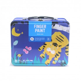
toy tin box
custom tin box
printing box
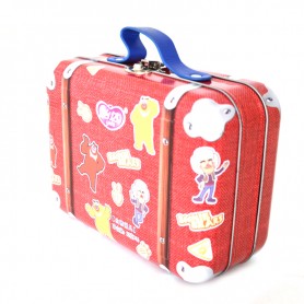
panini football player sticker tin box
coffee box
tin box
tin-box
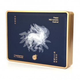
christmas gift tin box
tin food containers
tin packaging
heart-shaped tin box
tin can
tinplate printing
Photo gallery
-

Company design team
-

Customer Service


Latest comments