As a professional...
How to match the color of tin box packaging
Color is the first element that affects the senses. When people observe objects, the optic nerve responds the fastest to color, and it is accompanied by the activities of other senses, thereby producing perception and consciousness. Colors quietly influence people's behavior, and subtly affect people's emotions. Therefore, the color matching of tin can packaging design must be based on the laws of color science and various survey reports, not only to reflect the performance and use of the product itself, but also to be able to successfully attract the attention of consumers and make them desire to buy, in order to achieve purpose of sale. Through the analysis of color characteristics and functions in packaging design, this paper studies the principles of color matching in packaging design, and how to carry out color matching to make products more attractive.
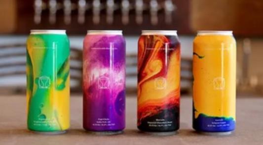
tin color
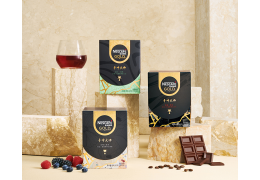
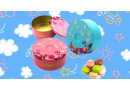
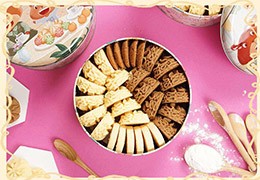
(1) Going forward from the industry, the main colors of food are light yellow and pink to express, which gives people a sense of warmth and intimacy. Of course, green tea is used a lot, and drinks are green and blue. A lot of bright red is used for wine and cakes, a lot of rose is used for children's food, and the main colors of daily cosmetics are mostly rose, pink white, light green, light blue, dark brown. In order to highlight the warmth and elegance, the clothing, shoes and hats are mostly dark green, dark blue, brown or gray to highlight the beauty of calm and elegance.
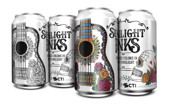
color contrast
(2) The principle of color matching: The characteristics of the product are intuitively transmitted to consumers through the use of color, and the color matching design of the packaging should follow this principle. Color is the most flexible and changeable factor in packaging design. The color in packaging design is consistent with the principle of pure painting color, but the color in packaging design is commodity color, not pure painting color pursued by painters. The colors in the packaging design should be able to protect, render and promote the packaged goods. The color matching should enhance the visual impact of the packaging, attract the attention of consumers, and have a strong appeal to consumers, making consumers more attractive. Consumers have the desire to buy and play a silent promotion role.
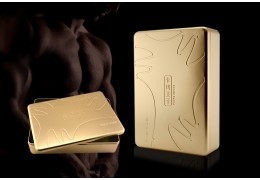
(3) The light-heavy contrast (or shade-contrast) used in the use of colors is also one of the important reproduction methods in the use of packaging colors. This kind of light-heavy contrast is often set off with a light and elegant background to set off a solemn and profound the theme pattern, or in the dignified and deep theme pattern (mostly with color block patterns). It shows the theme and name of the light and elegant packaging, as well as the trademark or slogan, etc. Conversely, it is also useful for large-area Dignified and deep pigments are used as the base. In addition, light and elegant tones are used or concentrated in a certain color block or some patterns are fully decorated. In this light-heavy contrast, the general pigments have coordinated color contrast and cold and warm color contrast, and coordinated color contrast. The technique is often light green to dark green; light yellow to dark coffee; pink to red, etc., while the contrast of cool and warm colors is mostly black and white, red and blue, etc.
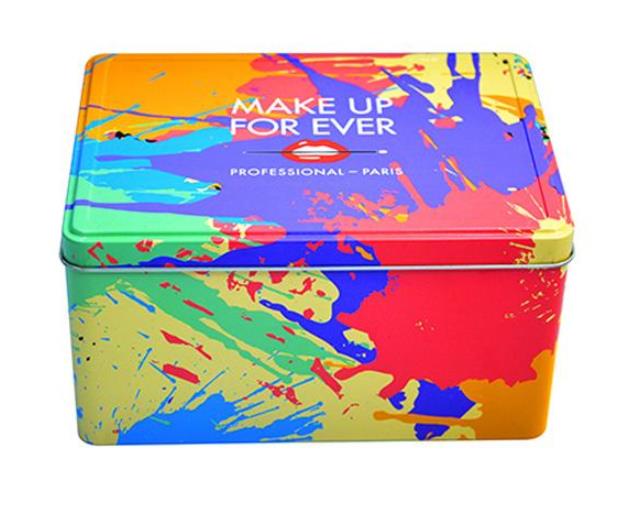
(4) Point-to-point comparison (or size comparison) used in color This kind of contrast is mainly used in the design process of a packaging screen, using the contrast from a central or concentrated point on the pigment to the overall screen, that is, a small range and a large range Contrast between pictures. In daily life, especially in washing and cosmetic products, we can see that on the packaging box of a product, the entire area is clean and there is nothing, but a very obvious heavy color appears in the middle. The small square (or oval or small round) of the package and then reflect the theme of the brand and name of the package content from the picture of this small square, which is not only the combination of point and surface, but also the contrast between large and small, Occasionally, there are contrasts that transition from point to point.
.png)
.jpg)
.jpg)
.jpg)




Latest comments