As a professional...
Packaging Box Design Tips
In this era of the Internet of Things, the creativity and innovation of packaging design has also become the primary condition for grabbing the attention of consumers. The first and foremost evaluation of the product is the quality, but after the quality, the packaging design is more important.
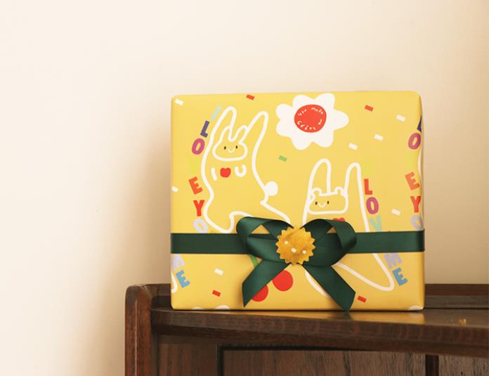
01. Explore the competitive environment
Before starting the design, we must first understand what kind of market this product can enter, and then conduct in-depth market research and ask questions from the perspective of brand owners:
▶Who am I? Can I be trusted by consumers?
▶What makes me different?
▶ Can I stand out from the crowd of competitors?
▶Why do consumers choose me?
▶What is the biggest benefit or advantage I can bring to the consumer?
▶ How can I create an emotional connection with consumers?
▶What hinting methods can I use?
The purpose of exploring the competitive environment is to use differentiation strategies among similar products to promote the brand and product, and to give consumers a reason to choose this product.
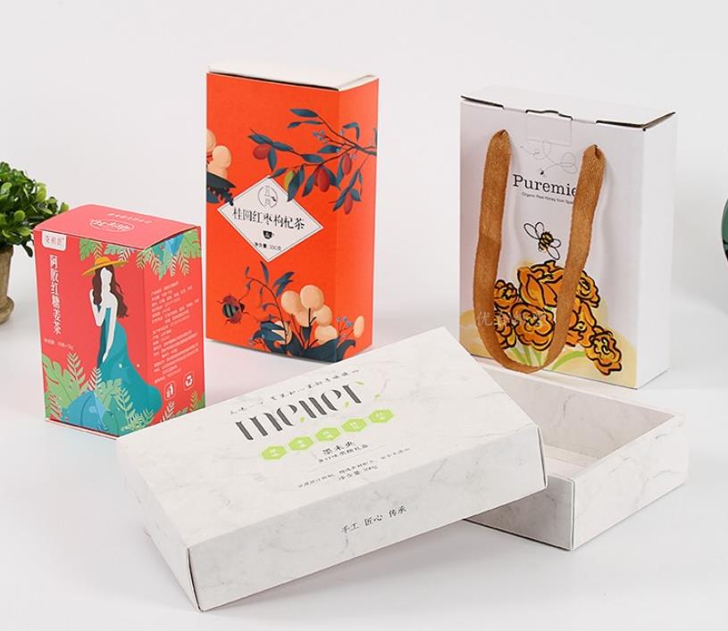
02. Establish information hierarchy
The organization of information is a key element of positive design.
Broadly speaking, the information hierarchy can be divided into the following levels: brand, product, variety, interest. When designing the front of the package, analyze the product information you want to convey and rank it in order of importance.
Establish an orderly and consistent information hierarchy, so that consumers can quickly find the products they want among many products, so as to achieve a satisfactory consumption experience.
03. Create a focal point for design elements
Does the brand have enough personality for its product to stand in the market?
not necessarily! Because the designer also needs to clarify what the most important characteristic information of the product needs to be conveyed, and then put the main information that highlights the characteristics of the product in the most prominent position on the front.
If the branding of the product is the focal point of the design, consider adding a brand identity next to the brand logo. Use shapes, colors, illustrations, and photography to enhance your brand’s focal point.
Most importantly, allow consumers to quickly find the product the next time they shop.
04. Simplest rule
Less is more, it's a design wisdom.
The language expression and visual effects should be kept concise to ensure that the main visual cues on the packaging can be understood and accepted by the public.
Under normal circumstances, descriptions with more than two or three points will have the opposite effect. Too many descriptions of advantages will weaken the core brand information, thus causing consumers to lose interest in the product during the purchase process.
Keep in mind that most packages will have more information on the side, which is where shoppers look when they want to learn more about the product. Make the most of the side of the package and don’t take it lightly.
If you can't use the side of the package to display rich product information, you can also consider adding a hang tag to let consumers know more about the brand.
05. Use visuals to communicate value
It is almost always wise to have a transparent window on the front of the package to display the product inside, as consumers want visual confirmation when shopping.
In addition to this, shapes, patterns, graphics, and colors all have the ability to communicate without the aid of language.
You can make full use of those elements that can effectively display product attributes, stimulate consumers’ shopping desires, build consumer emotional connections, and highlight product textures to create a connection with a sense of belonging. Suggested images contain elements that characterize the product while incorporating lifestyle elements.
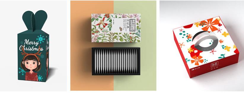
06. Pay attention to the unique rules of various commodities
No matter what kind of product, its packaging design has its own rules and characteristics, and some rules need to be followed meticulously.
Some rules are important because doing the opposite can make emerging brands stand out. However, for food, the product itself can almost always be the selling point, so food packaging is designed and printed with more emphasis on realistic reproduction of food images.
Conversely, for medicinal products, the brand and physical characteristics of the product may be secondary—sometimes unnecessary, and the parent brand logo may not need to appear on the front of the package, however, emphasizing the name and purpose of the product is very important. necessary.
Nonetheless, for all kinds of products, it is desirable to reduce the clutter caused by too much content on the front of the package, or even use a very simple front design.
07. The findability and purchasability of products cannot be ignored
When packaging designers design packaging for a specific product of a brand, they need to investigate how consumers buy such products to ensure that consumers do not have questions about product styles or information levels.
It is always important to remember that color is the number one element of communication, both cognitively and psychologically, followed by product shape.
Words are important, but they play a supporting role. Text and typography are reinforcing elements, not primary brand communication elements.
Packaging is the last link a consumer interacts with a brand before making a purchasing decision. Therefore, the design of the contents and effects displayed on the front of the package (the main display surface) has an irreplaceable role in marketing promotion.
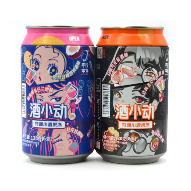
Although packaging design does not have obvious trend changes like fashion design, it does not mean that packaging design is static or free for designers.
If we study carefully, we will find that in fact, new styles of packaging design will be born every year, and new techniques will be widely used.
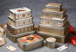
.png)
.jpg)
.jpg)
.jpg)






Latest comments