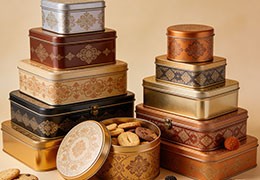
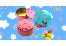
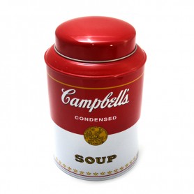
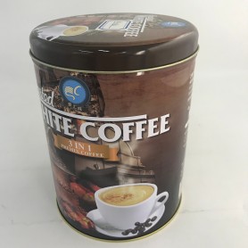
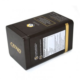
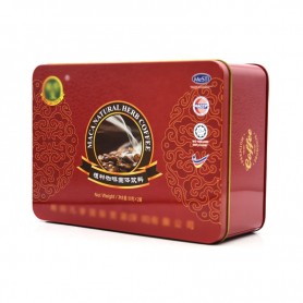
Embossed metal tin...
These amazing coffee packaging boxes make drinking coffee a beautiful thing
Life is sometimes slightly acidic and sometimes irritating;
Caffeine is the perfect spiritual healing for these adventures.
Did you have a good weekend? Did you drink good coffee? Today I would like to introduce you to 6 groups of excellent overseas coffee packaging designs, either light and lively, or literary texture, or natural and fresh, or exquisite and luxurious, making coffee tasters suddenly bright.
If you also like inspired designs, come and have a look with the owner! While gaining good reviews, it also naturally boosted sales, which is worth learning and collecting.
Lively
This type of coffee brand design usually adopts a relaxed and lively tone, and uses a fun design to convey the mood of people needing coffee.
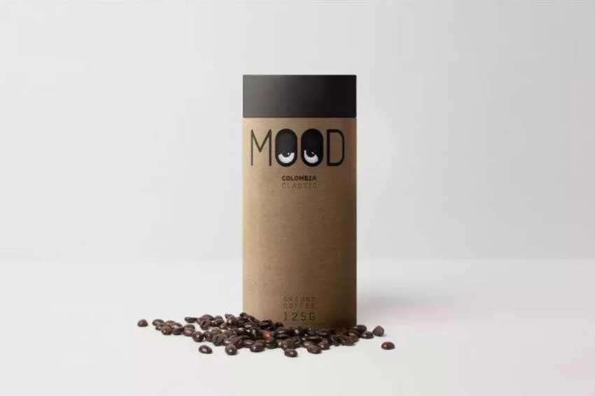
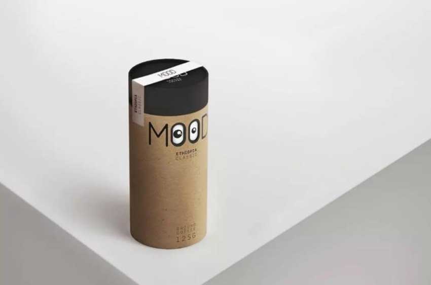
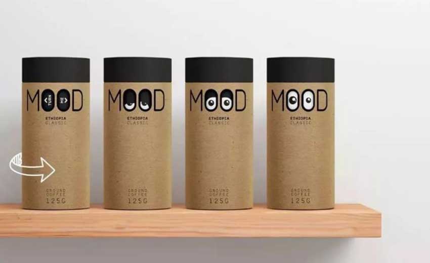
Mood X I have a pair of "big eyes" cute and funny big eyes
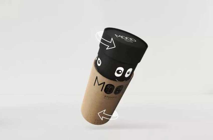
It is particularly worth mentioning that when you rotate the barrel, you can switch between different big-eyed expressions and instantly ignite your childlike innocence. In the delicious coffee time, play happily with big eyes.
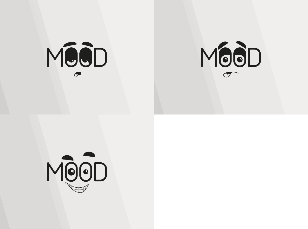
This coffee from Moscow has a unique packaging shape, which sells cutely with a pair of cute big eyes. The designer gave the coffee beans a personal expression, the flickering big eyes seem to be able to speak, conveying the mood of people needing coffee.
PERKSE X Little Whale in a Coffee Cup
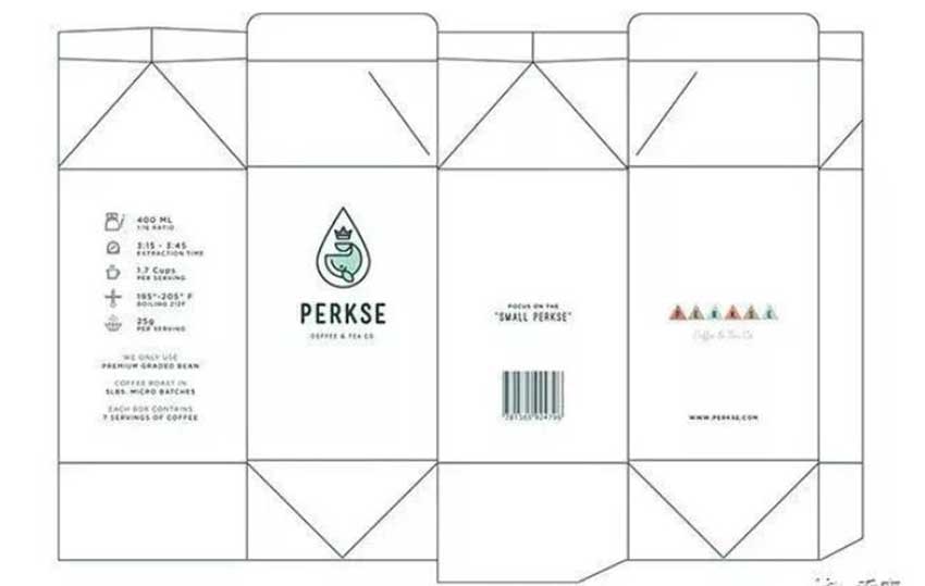
PERKSE's packaging looks simple, fresh and interesting. There is not too much color, and the lines are clean; with some geometrically inspired illustrations, it is very lively and lively.
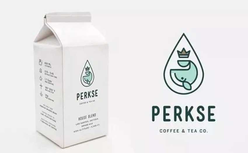
And the most attractive is the cute little whale design on the LOGO, so full of agility, that it seems to be able to swim out of the wrapping paper. Is there an urge to take the little whale home?
Sense of nature
This type of coffee brand design emphasizes more on "returning to nature and original ecology" and the product's dependence on local culture. Through patterns rooted in memory and traditions, coffee culture is permeated into people's lives.
Archer Farms X original flavor
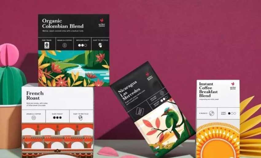
This is a series that I like very much. This eye-catching and stunning coffee packaging comes from Archer Farms. Use cartoon illustrations and vivid colors to distinguish it from other coffee packaging. Coffee beans from different origins use different patterns and colors, which are very impressive and have a strong story.
From a coffee bean to coffee, it is destined to go through thousands of trials and traverse a complex and extraordinary road. The colorful colors not only show the style and features of different coffee producing areas, but also emphasize the original ecological concept of good coffee from "seed to cup", in order to appeal to people to cherish the hard-won coffee deliciousness.
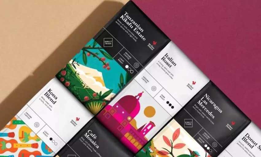
For products, image and display are more important than ever. The way of display determines whether the product will be selected from the shelves of the hypermarket, and because of the fierce competition, they must also distinguish and attract people's attention.
You can't deny that when you eat, presentations can have a big impact on your mood. Packaging design evolved from this point. It is not only limited to display, but also limited to differences. The easier it is to see the product and attract our attention, the faster the purchase.
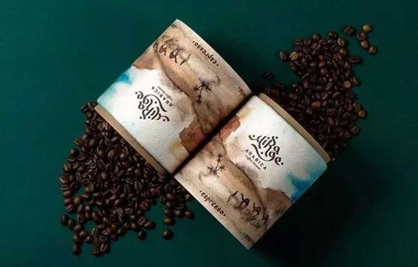
The redesign of coffee and tea is inspired by the vibrant qualities of social gatherings. The bold triangle of the bag creates a focal point that redirects the customer to the coffee blend type. The elongated packaging design is high from all competitors, keeping the fresh coffee with a resealable premium grade adhesive that is easy to open and easy to close.


.jpg)





Latest comments