
As a professional...
Catégories de blogs
Rechercher dans blog
Derniers articles
.png "Dans le cadre de l’interdiction mondiale du plastique en 2025, comment les boîtes en fer blanc de qualité alimentaire peuvent-elles devenir le nouveau favori des emballages écologiques ?")
.jpg "De la conception à la production en série : comment les usines de boîtes en fer blanc répondent-elles aux besoins de personnalisation personnalisés des clients ?")
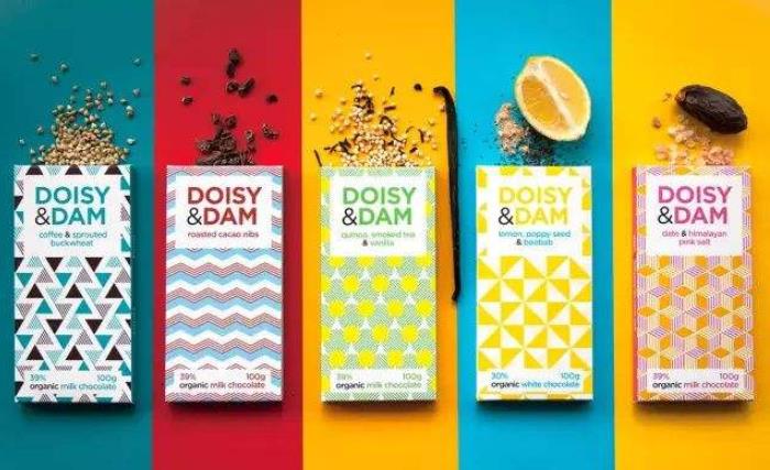
.jpg "La tendance future de l’emballage en boîtes métalliques : comment les usines peuvent-elles saisir les opportunités du marché grâce à une technologie innovante ?")
.jpg "Le guide ultime pour acheter des boîtes en fer blanc : comment identifier une bonne usine d'un mauvais fournisseur ?")
Articles populaires


Articles en vedette
Tags de blog
boîte en métal
boîte à biscuits personnalisée en gros
boîte à bonbons de noël
prix de la boîte en fer blanc personnalisée
fabricant de boîtes de rangement en métal
boîte en fer blanc avec sécurité enfant
boîtes de bonbons vides en gros
fournisseurs de boîtes de bonbons à la menthe
boîte à bonbons en forme de citrouille personnalisée
fabricant de boîtes en fer blanc personnalisées
boîte cadeau de noël avec couvercle
coffret cadeau de noel
boite en étain
grossiste de mini boîtes en fer blanc personnalisées
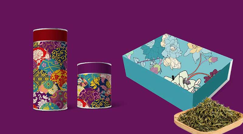
boîte à thé personnalisée
boîte à bonbons de noël en étain
boîte de cadeau de noël en gros
emballage en boîte de chocolat
boîte ronde en fer blanc
fabricant de boîtes en fer blanc personnalisées en chine
Galerie de photos
-

Sample gallery
-

Customer Service


Derniers commentaires