
As a professional...
Categorías de blogs
Buscar en blog
Últimas entradas del blog
.png "Con la prohibición mundial del plástico de 2025, ¿cómo pueden las cajas de hojalata de calidad alimentaria convertirse en el nuevo embalaje ecológico favorito?")
.jpg "Del diseño a la producción en masa: ¿Cómo satisfacen las fábricas de cajas de hojalata las necesidades de personalización de los clientes?")
.jpg "La tendencia futura de los envases de caja de hojalata: ¿cómo pueden las fábricas aprovechar las oportunidades del mercado con tecnología innovadora?")
.jpg "La guía definitiva para comprar cajas de hojalata: ¿Cómo identificar una buena fábrica de un mal proveedor?")
Entradas de blog populares


Entradas de blog destacadas
Etiquetas de blog
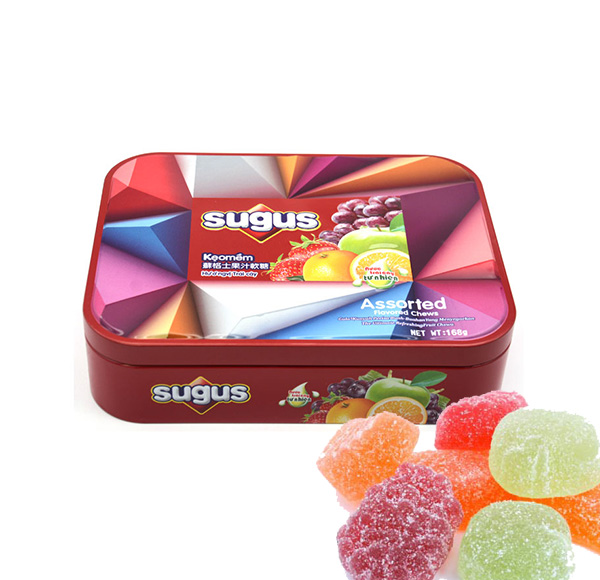
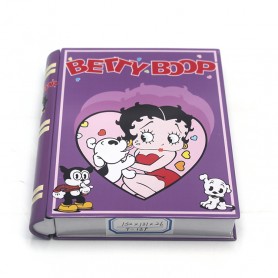
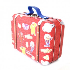
venta al por mayor mini caja de lata impresa personalizada
caja de lata con forma de calabaza personalizada al por mayor
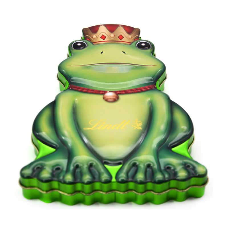
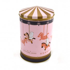
lata de galletas navideñas personalizada personalizada
cajas de lata de dulces vacías al por mayor.
caja de regalo de navidad
contenedor de hojalata a prueba de niños
caja de lata de té personalizada
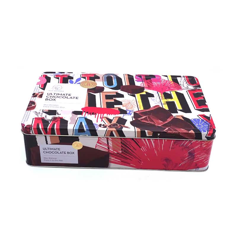
caja de hojalata vacía personalizada
fabricante de envases de caja de hojalata
mayoristas de caja de lata de la navidad
proveedor de embalaje de caja de hojalata
venta al por major cajas de hojalata
fabricante de cajas de almacenamiento de metal.
caja de hojalata con cierre de seguridad para niños.
proveedor de cajas de lata para regalos navideños
fabricante de cajas de hojalata personalizadas
lata de galletas personalizada al por mayor
proveedores de caja de lata de caramelo de menta
caja metálica de hojalata con tapa.
latas de velas de emergencia
Galería de fotos
-

Sample gallery
-

Customer Service


Últimos comentarios